Dialog Designer
Dialog Designer is an IDE packaged with the Custom dialog activity. It provides developers a graphical interface to easily design custom dialogs to be used within a task and helps to create a more effective, user-friendly environment, tailored to their specific needs.
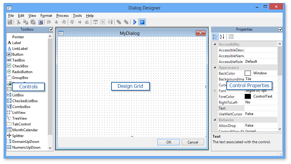
With Dialog Designer, you can create your own input forms, organize related tools in separate windows, add buttons directly to a view or layout and link what's displayed in a dialog directly to your data. It encompasses a modern dockable interface design similar to Visual Studio or Eclipse and supports a large number of controls. Each control has properties that you can view or edit from within the property grid, including control name, position, size and behavior. Controls also have events you can bind to your own script functions.
During construction, custom dialog definition is stored into an XML file. When you save the dialog, the Dialog Designer creates another XML file containing all the commands needed to create the dialog and all of its controls. When you are finished designing your custom dialog, the generated XML files are ready to be included into any task.
Dialog Designer Interface
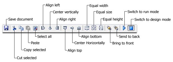
Toolbar buttons
Dialog Designer's toolbar comprises buttons, controls and other elements intended to provide fast access to the most commonly used design tools, such as height, width and alignment controls. Most of these functions are also available through the menu system. The specific functions required to use each control vary depending on the operation currently being performed. Available toolbar buttons are displayed below.
Creating/Editing a Custom dialog
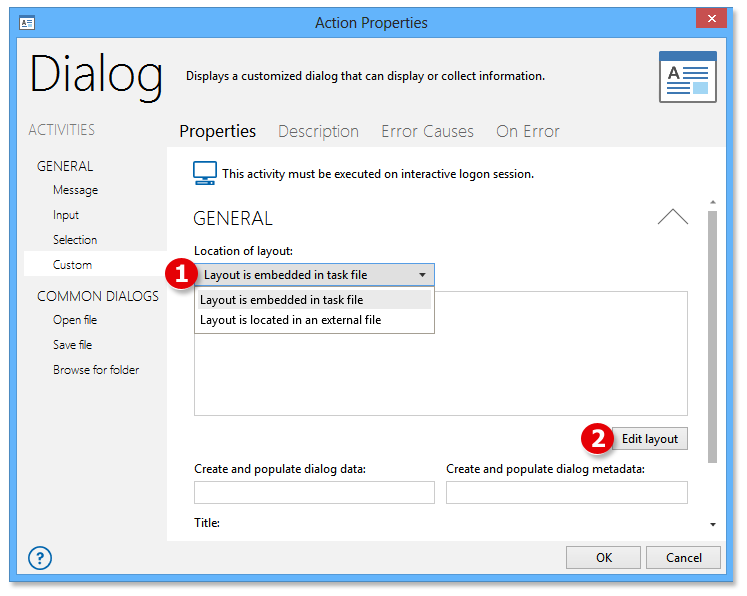
Dialog Designer can be invoked directly from the properties of the Custom Dialog activity. Developers have the option to create a new layout or edit an existing layout embedded within the task (.AML) file or previously saved to an external (.XML) file.
To create/Edit a custom layout:
-
From the General properties of the Custom Dialog activity, select from one of two options contained in the Location of layout parameter (step 1 displayed below):
-
Layout is embedded in task file - If creating a new custom dialog, selecting this option will save the layout definition as code embedded directly within the current task (.aml) file. If editing an existing custom dialog, selecting this option allows changes to be made to the layout embedded within the current task file.
-
Layout is located in an external file - If creating a new custom dialog, selecting this option saves the layout definition to a .XML file located externally. If editing an existing custom dialog, selecting this option allows changes to be made to an existing layout previously saved to an external .XML file.
-
-
Press the Edit Layout button to open the Dialog Designer interface (step 2 displayed below).
-
Add controls to the Design Grid by choosing them from the Toolbox. This can be done a few ways:
-
Drag the desired control from the Toolbox onto a specific location on the Design Grid.
-
Select (highlight) the desired control from the Toolbox then click a specific area on the Control Grid in which to place the control.
-
Edit a control's properties by selecting them from the Properties panel and performing desired modifications.
-
To save changes, select File -> Updateor press theSaveicon located on the toolbar.Two things can happen depending on whether the layout is saved to an external file or embedded in the task:
-
If the layout location is set to external file, aSave Asdialog opens allowing you to select the filename and location of the external XML file.
-
If the layout is set to be embedded in the task, this procedure will automatically insert the proper code onto the task (AML) file.
-
To close the Dialog Designer, select File -> Close.
Available Controls
Dialog Designer contains a number of different controls you can include on your custom dialogs. The table below describes the most commonly used controls.
|
Icon |
Name |
Description |
|---|---|---|
|
|
Label |
A label represents a simple text control that can be bound to other controls. It can be used to display static text such as captions and instructions for using the dialog. |
|
|
Link label |
A link label is the visible, clickable text in a hyperlink. |
|
|
Button |
A button performs a task when you click it, but with an icon to illustrate its action. Buttons on a dialog work the same way as buttons on a ribbon or toolbar. |
|
|
Text box |
A text box accepts multiple lines of information from the user or displays multiple lines of information provided by a program. |
|
|
Check box |
A check box allows a user to turn on (check) or turn off (uncheck) a specific option. |
|
|
Radio button |
A radio button can be combined with other radio buttons to provide an exclusive set of choices. |
|
|
Group box |
A group box is a container control that can be used to define groups of controls. The typical use for a group box is to contain a logical group of radio button controls. |
|
|
Picture box |
A picture box displays a static picture on the dialog, such as a company logo. Acceptable file formats include TIFF, GIF, and bitmap files. |
|
|
List box |
A list box displays a single or multi-column list of choices from which the user can choose. The user simply clicks inside the box corresponding to a specific choice in order to select it. |
|
|
Combo Box |
A combo box displays a single column list of choices that appears to drop down when the user clicks it. |
|
|
List view |
A list view provides the infrastructure to display a set of data items in different layouts or views. |
|
|
Tree view |
A tree view presents a hierarchical view of information visualized by indentation in a list. Each item (often called a branch or a node) can have a number of sub-items. |
|
|
Tab control |
A t ab control is analogous to the dividers in a notebook or the labels in a file cabinet. By using a tab control, you can define multiple pages for the same area of a window or dialog box. |
|
|
Date/ Time picker |
A date/time picker allows selecting a date and time by editing the displayed values in the control. The user can make selection by clicking the required date/time. The new selected value appears in the text box part of the control. |
|
|
Month calendar |
A month calendar is used to display a calendar in the dialog. This control displays a one-month calendar that allows the user to select dates and move to the next and previous months. |
|
|
Splitter |
A splitter represents a control that redistributes space between panels or views in a dialog window. |
|
|
Domain Up Down |
A domain up down control provides a spin (up/down) interface to move through pre-defined items using up and down arrows or by pressing the UP and DOWN ARROW keys. |
|
|
Numeric Up Down |
A numeric up down control provides a spin (up/down) interface that displays and sets a single numeric value from a list of choices. The user can increase and decrease the number by clicking up and down arrows, by pressing the UP and DOWN ARROW keys, or by typing a number. |
|
|
Track Bar |
A track bar (also known as a slider) allows you to set a discrete value within a finite range of values. A slider can be oriented horizontally or vertically. |


