Widgets
Overview
Widgets are visual representations of individual items of Health and Performance metric data extracted from the Vityl IT & Business Monitoring Data sources and Business Assets that you have configured on the system to which you are connected.
Widgets are added to a dashboard layout which can be customized to provide a unique, at-a-glance, real-time view of your business.
The following widgets are available in Vityl IT & Business Monitoring.
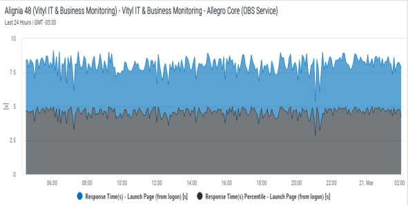
The Chart widget displays data from the selected data source and business metric combination in the form of a chart based on an 'X' and 'Y' axis. For some Performance Metrics, two different indicators can be selected and displayed in the same chart.

The chart can take any one of the following formats (Some formats may not be available for specific datasource and business metric combinations):
- Line - The returned data is displayed in the form of a single line
- Area - The returned data is displayed in the form of a shaded area
- Bar - The returned data is displayed in the form of a horizontal bar graph
- Column - The returned data is displayed in the form of a vertical bar graph
- Min/Max - The returned data is displayed as the minimum and maximum extremities of the captured data in a 'candlestick' type display. This chart is only available if only one metric is selected
- Stacked Area - The returned data is displayed in the form of a shaded area but colorized to represent the different thresholds defined within the metric
- Stacked Bar - The returned data is displayed in the form of a horizontal bar graph but colorized to represent the different thresholds defined within the metric
- Stacked Column - The returned data is displayed in the form of a vertical bar graph but colorized to represent the different thresholds defined within the metric
When using a Chart widget you can use the pre-defined Fixed Time Range or you can specify the time period for which the returned data is displayed.
>>See: Adding a Chart widget
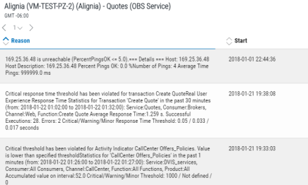
The List widget displays a list of Issues and, dependent upon the selected asset, Performance metrics that are currently affecting the asset.

Location: Select this option to display the host and application on which the selected asset is running.
Name: Select this option to display the name of the process that is causing the issue to be reported.
Reason: Select this option to display the reason why the issue has been raised.
Start: Select this option to display the time at which the issue was raised.
Status: Select this option to show a graphical representation of the current status.
Click on the issue to access it directly from within Vityl IT & Business Monitoring.
>>See: Adding a List widget
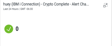
The Key Indicator widget is used to display both the health status and if available, summarized value data of an important business asset.
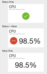
You can display just the health status, or to applicable assets, the health status and value or the value only.
The following are examples of what can be displayed using the Key Indicator widget.

Health Status
The Key Indicator widget displays a colored, graphical representation of the current health status of the selected data source asset. The current status is representative of the integrated state of the component parts of the datasource asset (i.e. Business dependencies are taken into account). The colors are hard-coded in Vityl IT & Business Monitoring and the following statuses can be displayed:

|
Good Health |

|
Warning |

|
Critical |

|
Minor |

|
Monitoring Error |

|
Unknown |
For example, the business asset below is deemed to be in Critical Health status.

Key Indicator values
The following key indicator values can be displayed:
- Average value of the period
- Sum of all values in the period
- Min value over the period
- Max value over the period
- Last value in the period
The example, below shows the current health status and value for a specific business asset

The asset name and type can be displayed alongside the status. Alternatively, a custom label can be displayed or the asset status can be simply shown as a graphic with no textual representation.
When using a Key Indicator widget you can used the default time range that applies to the dashboard or specify a Fixed Time Range for which the returned data is displayed.
The Title widget can be used to display your company’s branding in order to share the contents on a big screen, to the higher business levels and in reports or presentations. Format options allow you to specify:
- Title
- Subtitle
- Text Alignment
- Background Image or Color
- Image Adjustment
- Image Alignment
A title widget can also be used to link to another dashboard or an external web address.
>>See: Adding a Title widget