Widget Settings Tabs
Every widget has available Settings Tabs. The settings available in each tab depend on the type of widget selected. See below for settings definitions by widget type:
The available settings will vary depending on the type of chart you select for the widget. All of the settings are described below.
Data Tab
Select Metrics
From this list, select the metrics you would like to display. The metrics available depend on the Asset chosen.
Grouping Field
You can use this setting to change the field that the data is grouped by from the drop-down list of available fields.
Fixed Time Range
You can toggle this on to set a specific, fixed time range for the data that is displayed. The default is Last 24 Hours. There are a number of other possible values.
Auto-Refresh
You can change the default refresh rate by turning this setting to custom and enter the number of minutes to wait until the next refresh, or keep this setting at inherit to have your widget's refresh rate be the same as the parent dashboard.
Compare With Previous Period
You can toggle Compare With Previous Period on or off to specify whether or not you want to view the data for a previous period alongside the current period data.
Metric Aggregation
You can group your field using an aggregate function. You can select average value, sum of all values, minimum value, maximum value, or last value.
Filters
You can filter the data you see in your widget based on the options of the selected asset. Turn on to modify filtering options. You can then select the options you would like shown in your widget. Turning filtering off is the equivalent of selecting all options or selection options previously set up in your product. Filters are only available for some products.
Layout Tab
Header
You can use this setting to hide or show the widget header. The default is to show.
Title
You can use this setting to hide or show the widget title. The default is to show.
Legends
You can use this setting to hide or show the widget legends. The default is to show.
Data Labels
You can use this setting to define what should display in your chat next to each data point.
Grid Lines
You can use this setting to hide or show the widget grid lines. The default is to show.
Thresholds
You can use this setting to hide or show the widget thresholds.
Stacked Chart
You can use this setting to show your chart data stacked together within a label by selecting on or separated out by selecting off.
Axis Labels
You can use this setting to hide or show the widget axis labels. The default is to show.
Axis Label
You can use this setting to change the chart axis label. Change setting to custom and enter a new label to change.
Axis Unit Label
You can use this setting to change the chart axis unit label. Change setting to custom and enter a new label to change.
Axis Range
You can use this setting to change the chart axis range. Change setting to custom and enter a new range to change.
Styles Tab
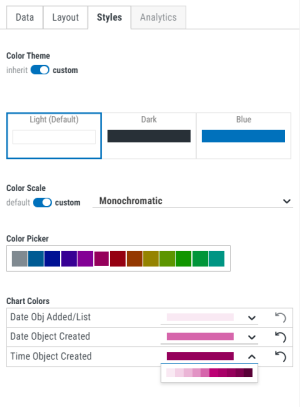
Color Theme
Toggle to custom to set the color theme for this individual widget instead of using what was set for the dashboard. Then, select a color.
Color Scale
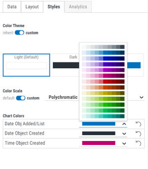
Toggle Color Scale to custom to set your widget to use a monochromatic or polychromatic color scheme.
Color Picker
If you selected Monochromatic for Color Scale, select the color to use for your metrics.
Chart Colors
Select the color you would like to use for each metric within the widget.
- If you selected Monochromatic for Color Scale, you can set each metric to a different shade of the color you selected for Color Picker. Use
 to revert back to the default color. A monochromatic color scale can only be used if 10 or fewer metrics are selected. If more than 10 metrics are selected, the monochromatic option is disabled.
- If you select Polychromatic for Color Scale, you can set each metric to any shade of any color. Use
 to revert back to the default color.
Pie Charts
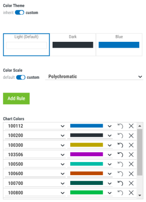
With pie charts, colors are used to represent data, not metrics. Rules are used to control the color of the shown data. Both polychromatic or monochromatic color scales can be used. You can add up to 27 rules for polychromatic scales and 10 rules for monochromatic scales.
Select Add Rule, then use the drop down under Chart Colors to select the data and associated color. Use  to revert back to the default color. Use
 ![]() to remove the rule.
to remove the rule.

Data Tab
Select Metrics
From this list, select the metrics you would like to display. The metrics available depend on the Asset chosen.
Grouping Field
You can use this setting to change the field that the data is grouped by from the drop-down list of available fields.
Fixed Time Range
You can toggle this on to set a specific, fixed time range for the data that is displayed. The default is Last 24 Hours. There are a number of other possible values.
Auto-Refresh
You can change the default refresh rate by turning this setting to custom and enter the number of minutes to wait until the next refresh, or keep this setting at inherit to have your widget's refresh rate be the same as the parent dashboard.
Filters
You can filter the data you see in your widget based on the options of the selected asset. Turn on to modify filtering options. You can then select the options you would like shown in your widget. Turning filtering off is the equivalent of selecting all options or selection options previously set up in your product. Filters are only available for some products.
Layout Tab
Header
You can use this setting to hide or show the widget header. The default is to show.
Title
You can use this setting to hide or show the widget Title. The default is to show.
List Settings - Column Order and Default Sorting
Use this setting to change the order in which the selected fields are displayed in the widget and the desired sort order within each field (Ascending or Descending). You can also delete out selected fields from the display.
Styles Tab
Color Theme
Toggle to custom to set the color theme for this individual widget instead of using what was set for the dashboard. Then, select a color.
Analytics Tab
If you have Insite Analytics installed and licensed the Analytics Tab will be configurable. The Analytics Tab is only available for List type widgets and you must have at least one numeric metric selected on the Data Tab.
Decoration Columns
This will show which column are configurable with Data Decorations as well as the Type of decoration selected.
If nothing has been set up, the Type will be None. To set up Data Decorations, select the  to Show Actions. Then select Edit Decoration.
Data Decorations
Toggle this to Show to indicate that you want to use data decorations in the widget. Then, select what the decorations should be based upon. You can choose from Standard Deviation, Percentages, Duplications, or create custom rules.
- Standard Deviation - Insite Analytics will calculate the mean and standard deviation of your data and then highlight each data point according to where it lies on the data's distribution curve. Adjusting the number of Steps will increase the number of standard deviation boundaries that are highlighted +/- the mean.
- Percentages - Insite Analytics will detect the maximum and minimum values in your data and then calculate where each data point lies across that range. Cells that fall in similar percentiles are highlighted with the same color, allowing you to easily identify values that lie close to either end of the range. Adjusting the number of steps will control the level of granularity.
- Duplications - Insite Analytics will examine your data and decorate all cells containing the same value with a unique color. This allows you to understand how the data is clustered and to detect conflicts. If you turn on Five Most Frequent Decorations, you can assign a unique color to five of the most frequently occurring data points. If you turn this off you can choose to highlight any duplicates in the data with the same color.
- Custom - Insite Analytics allows you to set one or more custom thresholds on your data, allowing you to highlight data points that meet your unique criteria. Define an evaluation equation for Insite Analytics to use and choose a color for it to highlight cells that meet that criteria.
(Step)
Select the number of steps to use when displaying the decoration.
Scale
Select the color scale you want used.
Data Tab
Select Metrics
From this list, select the metrics you would like to display. The metrics available depend on the Asset chosen.
Grouping Field
You can use this setting to change the field that the data is grouped by from the drop-down list of available fields.
Fixed Time Range
You can toggle this on to set a specific, fixed time range for the data that is displayed. The default is Last 24 Hours. There are a number of other possible values.
Auto-Refresh
You can change the default refresh rate by turning this setting to custom and enter the number of minutes to wait until the next refresh, or keep this setting at inherit to have your widget's refresh rate be the same as the parent dashboard.
Filters
You can filter the data you see in your widget based on the options of the selected asset. Turn on to modify filtering options. You can then select the options you would like shown in your widget. Turning filtering off is the equivalent of selecting all options or selecting options previously set up in your product. Filters are only available for some products.
Layout Tab
Header
You can use this setting to hide or show the widget header. The default is to show.
Title
You can use this setting to hide or show the widget Title. The default is to show.
Compare With Previous Period
Toggle Compare With Previous Period on or off to specify whether or not you want to view the data for a previous period alongside the current period data.
Metric Aggregation
You can group your field using an aggregate function. You can select average value, sum of all values, minimum value, maximum value, or last value.
Unit Label
You can use this setting to change the value of the Unit Label by selecting 'custom' and typing in your own value (if desired). The default is to use the default Unit Label.
Text Size
You can use this setting to change the size of the text in the widget. You can select small, medium, large, extra large, or responsive (default).
Use Status Color as Widget Background
You can use this setting to change the background of your widget to be the color of the status that is defined in a threshold.
Thresholds
You can define a status to a specific set of conditions and values. To add a new threshold, turn on custom, then select Add Rule.
Styles Tab
Color Theme
Toggle to custom to set the color theme for this individual widget instead of using what was set for the dashboard. Then, select a color.
Layout Tab
Title
Enter the title of your widget in this field.
Subtitle
Enter the subtitle of your widget in this field.
Text Align
You can use this setting to display your widget text as left-aligned, right-aligned, or centered
Background Options
You can use this setting to upload an image as your widget background or select a solid color background.
Widget Links
You can use this setting to add a link to an existing dashboard or an external URL. To activate this feature, follow these steps:
- Select either External URL or Dashboard from the Type drop-down.
- If you selected External URL, then enter the site URL in the URL field and the text you would like displayed as link text in the Link Display Text field.
- If you selected Dashboard, then select the dashboard you would like to link to from the list of existing dashboards.
- Click Save.
Styles Tab
Color Theme
Toggle to custom to set the color theme for this individual widget instead of using what was set for the dashboard. Then, select a color.
For more information, see Widget Groups.
Layout Tab
Header
You can use this setting to hide or show the widget header. The default is to show.
Title
You can use this setting to hide or show the widget Title. The default is to show.
Subtitle
Enter the subtitle of your widget in this field.
You can define a status to a specific set of conditions and values. To add a new threshold, turn on custom, then select Add Rule.