Description
Displays an auto-generated multiple choice dialog box based the options you specify. Choice is useful when a multiple-choice selection is needed or the user must make a decision that will affect the action taken by a Workflow. The value associated with the item that the user selects is placed into a variable where it can be evaluated and acted on.
Practical Use
Similar to the Input Box <AMINPUTBOX> action except allows the user to enter a text value in response to a question. The text value is populated into a variable which can be used later in the Workflow.
Declaration
<AMSELECTITEM MESSAGETEXT="test" WINDOWTITLE="text" LISTTYPE="option" RESULTVARIABLE="text" ITEMS="text" VALUES="text" SELECTED="1" VALUEONCANCEL="text" FORCESELECT="yes/no" MULTIPLE="yes/no">
Example
<!---This Workflow shows how to use the choice action and make
decisions based on the answer--->
<AMVARIABLE NAME="foodchoice"></AMVARIABLE>
<AMSELECTITEM MESSAGETEXT="What would you like to eat?" WINDOWTITLE="What's for dinner?" LISTTYPE="option" RESULTVARIABLE="foodchoice" ITEMS="Hamburger,Pasta,Chicken" VALUES="1,2,3" SELECTED="1">
<AMIF EXPRESSION="%foodchoice% = 1">
<AMMESSAGEBOX>You chose Hamburger</AMMESSAGEBOX>
</AMIF>
<AMIF EXPRESSION="%foodchoice% = 2">
<AMMESSAGEBOX>You chose pasta</AMMESSAGEBOX>
</AMIF>
<AMIF EXPRESSION="%foodchoice% = 3">
<AMMESSAGEBOX>You chose chicken</AMMESSAGEBOX>
</AMIF>
General Tab Parameters

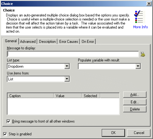
Message to display: Specifies the text to be displayed in the choice dialog box. Usually this is a question that the user should select the answer to.
Text, Required
MARKUP: MESSAGETEXT="The contents of the variable is %VARNAME%"
List type: Specifies the manner by which the list will be displayed on the auto-generated form at runtime. This selection is relevant not only for aesthetics but will also affect the ability of the user to make a multiple choice selection (see below).
dropdown: The items in the list will be placed into a dropdown combobox (does not allow multiple selections).
check box: The items in the list will be represented as a collection of check boxes (allows multiple selections).
option: The items in the list will be represented as a collection of option buttons (also known as radio buttons) (does not allow multiple selections).
list: The items in the list will be represented as a list box (allows multiple selections).
Text [options], Required
MARKUP: LISTTYPE="combobox"
Populate variable with result: Specifies the name of an already created variable that should be populated with the value parameter of the item selected. If the user has selected multiple items the values are returned as a comma-delimited list.
text, Required
MARKUP: RESULTVARIABLE="varname"
Use items from: Specifies a comma-delimited list of items in the list. The items represent the text value that is displayed not necessarily the value that is returned by the item (that is determined by the VALUES= parameter).
list, Required
MARKUP: ITEMS="item1, item2"
Values: Specifies a comma-delimited list of values in the list. The values represent value(s) will be returned by the item if selected at runtime by the user. There must be an equivalent number of values to items. Each value must have a corresponding item in the ITEMS= parameter.
list, Required
MARKUP: VALUES="value1, value2"
Selected: Specifies the index (base 1) numbers of the items that should be checked or selected by default. Depending on the list type, the requirements for this parameter differ. In the case of a drop-down and options, one item must be selected. In the case of a list box or check boxes, none or multiple items may be specified. To specify multiple options the numbers should be comma-delimited.
list, Required
MARKUP: SELECTED="2"
Bring message to front of all other windows: When enabled/selected, displays the input box in front of all other open windows.
Advanced Tab Parameters

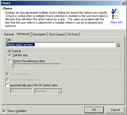
On Cancel: Specifies the value that should be returned into the variable if the user presses the "Cancel" button.
text, Optional - Default (blank)
MARKUP: VALUEONCANCEL="cancelled"
Force selection: Specifies that the user must make a valid selection before continuing. This option is only valid if LISTTYPE= check box or list, other list types automatically force selection.
yes/no, Optional - Default YES
MARKUP: FORCESELECT="NO"
Allow multiple selections: Specifies that multiple selections are allowed. This option is only valid if LISTTYPE= check box or list, as only those controls support multiple-selection.
text, Optional - Default NO
MARKUP: MULTIPLE="yes"
Automatically press the OK button after: Specifies the time that should elapse before the message box clears itself. If the value is 0, the message box is displayed indefinitely.
number, Optional - Default 0
MARKUP: COUNTDOWNDELAY="0"
See Also