Description
Displays a message box using the options you specify. Although user input is not normally required in EFT Server Event Rules, a message box is useful for debugging purposes. Message boxes are used to provide informative feedback to the user, or, alternatively, to ask the user a question which requires a "yes, no" or "ok, cancel" type of answer.
You can specify that a button is automatically "clicked" after a specified timeout, or you can disable the step that requires user input after you have completed debugging.
Declaration
<AMMESSAGEBOX WINDOWTITLE="text" BUTTONS="text [options]" POSITION="text [options]" XPOS="number" YPOS="number" DEFAULTBUTTON=number ONFIRSTBUTTONCLICK="text [options]" ONFIRSTBUTTONCLICKTASK="text" ONSECONDBUTTONCLICK="text [options]" ONSECONDBUTTONCLICKTASK="text" ONTHIRDBUTTONCLICK="text [options]" ONTHIRDBUTTONCLICKTASK="text" ICON="text [option]" WINDOWINFRONT="yes/no" RESULTVARIABLE="text" MODAL="yes/no" COUNTDOWNDELAY="number">text</AMMESSAGEBOX>
Example
<AMMESSAGEBOX WINDOWTITLE="Question" ICON="question" COUNTDOWNDELAY="10">Would you like to continue?</AMMESSAGEBOX>
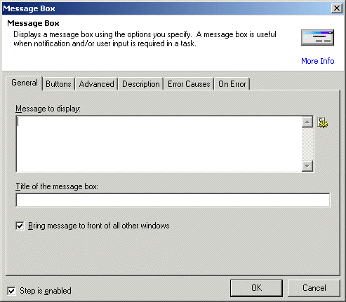
General Tab Parameters

Message to display: Specifies the text to be displayed in the message box.
Text, required
MARKUP: MESSAGETEXT="The contents of the variable is %VARNAME%"
Title of the message box: Specifies the title of the message box dialog.
Text, optional Default (blank)
MARKUP: WINDOWTITLE="QUESTION"
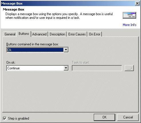
Buttons Tab Parameters

Buttons: Specifies the default button or array of buttons that should be displayed on the message box.
ok: The message box will contain an OK button only.
ok_cancel: The message box will contain an OK and CANCEL button.
retry_cancel: The message box will contain a RETRY and CANCEL button.
yes_no: The message box will contain a YES and NO button.
yes_no_cancel: The message box will contain a YES, NO, and CANCEL button.
abort_retry_ignore: The message box will contain a YES, NO, and CANCEL button.
Text [options], Optional - Default "ok"
MARKUP: BUTTONS="yes_no"
The boxes displayed on this tab depend on the selection in the Buttons box.
On (first button click): Specifies the action that should take place when the first (from left to right) button is clicked.
continue: When the button is pressed, the step will allow the Workflow to continue.
stop: When the button is pressed, the step will stop the Workflow.
fail: When the button is pressed, the step will fail.
start_Task: When the button is pressed, the another Workflow will be started. The Workflow to be started is specified in the ONFIRSTBUTTONCLICKTASK= parameter.
text [options], Optional - Default "continue"
MARKUP: ONFIRSTBUTTONCLICK="stop"
Task (Workflow) to start: Specifies the Workflow that should be run when the button is clicked. Valid only if ONFIRSTBUTTONCLICK="start_Workflow".
text, Optional - Default (none)
MARKUP: ONFIRSTBUTTONCLICKTASK="c:\foldername\Workflowname.aml"
On (second button click): Specifies the action that should take place when the second (from left to right) button is clicked.
continue: When the button is pressed, the step will allow the Workflow to continue.
stop: When the button is pressed, the step will stop the Workflow.
fail: When the button is pressed, the step will fail.
start_Task : When the button is pressed, the another Workflow will be started. The Workflow to be started is specified in the ONSECONDBUTTONCLICKTASK= parameter.
text [options], Optional - Default "continue"
MARKUP: ONSECONDBUTTONCLICK="stop"
Task (Workflow) to start: (On second button click) Specifies the Workflow that should be run when the button is clicked. Valid only if ONSECONDBUTTONCLICK="start_TASK".
text, Optional - Default (none)
MARKUP: ONSECONDBUTTONCLICKTASK="c:\foldername\Workflowname.aml"
On (third button click): Specifies the action that should take place when the third (from left to right) button is clicked.
continue: When the button is pressed, the step will allow the Workflow to continue.
stop: When the button is pressed, the step will stop the Workflow.
fail: When the button is pressed, the step will fail.
start_Task : When the button is pressed, the another Workflow will be started. The Workflow to be started is specified in the ONTHIRDBUTTONCLICKTASK= parameter.
text [options], Optional - Default "continue"
MARKUP: ONTHIRDBUTTONCLICK="stop"
Task (Workflow) to start: (On third button click) Specifies the Workflow that should be run when the button is clicked. Valid only if ONTHIRDBUTTONCLICK="start_TASK".
text, Optional - Default (none)
MARKUP: ONTHIRDBUTTONCLICKTASK="c:\foldername\Workflowname.aml"
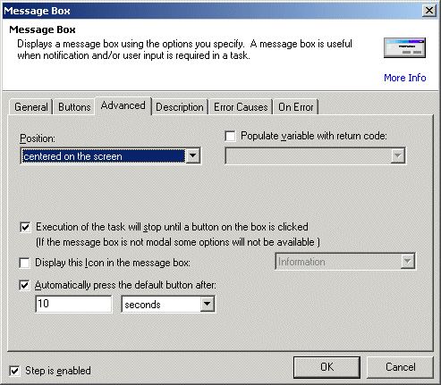
Advanced Tab Parameters

Position: Specifies the button or array of buttons that should be displayed on the message box.
upper_left: The message box will be displayed at the upper left of the screen.
center: The message box will be displayed at the center of the screen (default).
lower_left: The message box will be displayed at the lower left of the screen.
upper_right: The message box will be displayed at the upper right of the screen.
lower_right: The message box will be displayed at the lower right of the screen.
custom: The message box will be displayed at the pixel coordinates specified at XPOS= and YPOS=.
Text [options], Optional - Default "center"
MARKUP: POSITION="upper_left"
Populate variable with return code: Specifies the name of an already created variable that should be populated with the number of the button (from left to right) that has been clicked. This option is valid only if MODAL=yes.
text, Optional - Default (none)
MARKUP: RESULTVARIABLE="varname"
Execution of the task will stop until a button is clicked: Specifies whether the dialog should be displayed "modal" (the message box must be cleared before the Workflow moves on) or "modeless" the Workflow moves on immediately.
yes/no, Optional - YES
MARKUP: MODAL="no"
Display this Icon: Specifies the icon that should be displayed on the message box next to the icon. The icon helps to determine what type of message is being displayed.
none: No icon is displayed (default)
information: The standard Windows information icon is displayed.
question: The standard Windows question icon is displayed.
stop: The standard Windows stop icon is displayed.
text [options], Optional - Default "none"
MARKUP: ICON="stop"
Automatically press the default button after: Specifies the seconds that should elapse before the message box clears itself. If the value is 0, the message box is displayed indefinitely.
number, Optional - Default 0
MARKUP: COUNTDOWNDELAY="0"
X Pos: Specifies the X (horizontal) coordinates of the position that the message box dialog should be displayed on the screen. This option is only valid if POSITION="custom", otherwise it is ignored.
Number, Optional - Default 0
MARKUP: XPOS="55"
Y Pos: Specifies the Y (vertical) coordinates of the position that the message box dialog should be displayed on the screen. This option is only valid if POSITION="custom", otherwise it is ignored.
Number, Optional - Default 0
MARKUP: YPOS="55"
See Also